Subscribe For Free Updates!

We'll not spam mate! We promise.

Showing posts with label Fonts. Show all posts

Thursday, November 7, 2013

Most popular types of fonts for designing logo

When the logo designers have to create logos, they must select the right font according to some rules or guides, I subjected them before in this Thread . Now I review the most important and famous typefaces which is usually used in logo design. 
fonts-icon

category of type:

Choose a font that you think will match your design. ie. Oldstyle, Modern, Slab Serif, Sans Serif, Script, Decorative.

1. Helvetica:

Helvetica font
Helvetica may be considered to have a generic look,it is  popular due to It’s accessible and appealing.There are no distracting serifs  at the end of the letters and numbers. 
it’s possible to change the kerning and font style, for example light or extra bold to achieve something different, yet similar.

2. Frutiger:

Frutiger fonts
Frutiger is used in the identity of many brands, There are additional versions include Frutiger Next, Frutiger Arabic, Neue Frutiger, and Frutiger Greek variants. Its character is easily recognised.It is often used in magazines and booklets design.It has been also used as flickr logo font.

3. Myriad Pro:

Myriad Pro font 
The Myriad family is characterized  by a comfortable level of readability and accessibility,then this typface  met all of the requirements that any designer needed in the logo, so the most of designer used it.

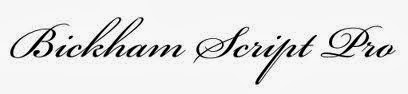
4.Bickham Script:

Bickham Script

It is english hand writing typface .Recognized as a master designer of pointed-quill script typefaces.Bickham Script Pro is offered in regular, semibold, and bold weights, It is often used in restaurant logos, and packaging design.

5.Trajan:

Trajan font
Trajan is an old style serif typeface designed in 1989 by Carol Twombly for Adobe. The design is based on Roman square capitals. It has been used in a huge number of movie title sequences and appeared on National television worldwide in numerous title and more popular on DVD packaging.

6.Bodoni:

Bodoni font

Bodoni has classic style,so it has been used in many logos of advertisement, Bodoni also has been used as basic text font of many magazine publications,In addition it is used for logo,titles,headlines, decorative text.

7.Adope Garamond:

Adope Garamond

Garamond font family has been widely used,There are many versions of this typeface but Adope Garamond is the most popular,It has been used in design simple graphic logo such as recognizable Google logo.
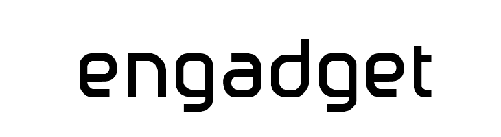
8.Engadget:

Engadget font
Engadget was created by John Stracke, This font is called Engadget because it is based on the letters in the logo of the Engadget.com blog.

 9.Klavika :

Klavika font
Klavika family is an ideal workhorse typeface because of its multiple numeral styles ,Klavika is a flexible family of sans serifs for editorial and identity design.It is also popular for its use of Facebook’s main logo. 

10. Hoefler Text :

Hoefler Text

Hoefler Text is a contemporary serif Antiqua font that was designed for Apple Computer to demonstrate advanced type technologies. Hoefler Text was used in the Wikipedia logo until the 2010 redesign, when it was replaced with Linux Libertine.

Tuesday, November 5, 2013

A Guide to Choosing Fonts for Logo Designers

There are many of the fonts used by designers in design logos, the type of font is the most important thing for a the logo designer , due to there are many logos which depend on fonts only such as Google logo,and others depend on consists of a combination between pictures and fonts.
font-icon

which fonts are ideal for design logos?

Have you ever had the problem of not knowing what fonts to use? don’t select your logo typefaces haphazardly. The following 10 rules for choosing typefaces for your logo design can guide you in making the best decisions for your brand identity
Choosing a suitable for a logo is not an easy task. As well as the overall legibility of the letters, their shape in combination must be considered. 

1.logo Design Goals:

Goal icon-png
The first step in selecting a typeface is to understand the needs and goals of the client, as well as the intended audience "identifying the age, attention span and demographics".
for example:Children are drawn to easy-to-read, childlike fonts; seniors to larger settings of typefaces with clarity and legibility; teens to edgier, So the main item to design successful logo is determination of your goal, and I referred to this point in this article extensively.

2.Mood:

mood icon
There is a wide variety of typefaces, and you’ll see that different typefaces can affect different feelings and set different moods,as example if you design a logo for a financial company, you will want to select a typeface that creates a sense of security and protection.
The mood set by the typefaces in your logo design must match your brand.

3.Readability:

Readability logo
Using complicated fonts can cause problems when printing in different sizes and materials. 
When designing for any logo,you should never let style get in the way of design. More importantly: style should not hinder the readability of the typeface.

4.Scalability :

Font size icon
Not all typefaces translate well to different sizes. Test out the typefaces you like in your logo design at various sizes to make sure they retain their legibility.

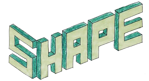
5.Get a feel for the curves and shapes:

shape icon
many designers will custom design or modify an existing typeface to help it better fit a logo, so analyzing the curves and shapes of the letter forms is an important order.

6.Balance:

balance icon
try balancing the weight of the mark to the weight of the selected typeface to create a stronger relationship.

7.Printing Method:

print icon
Consider the printing method being used, and what effect it has on the logo,View it in different colors and print it out on different types of paper to ensure it looks perfect all the time

8.Be original:

Be-original
Be sure to choose a typeface that doesn’t mimic your competitors. look for something more original to represent your business, there is great tools for helping you choose a font that fits your brand,such as Myfonts.com offer suitable options,  which lets you type in your text and see it onscreen in any font you choose (font preview).

9. Branding:

Branding
Your logo design should reflect your brand personality, so choose typefaces that match your brand persona.
The right font will make your logo recognizable and memorable; therefore increasing brand recognition.

10. Combine Typefaces Effectively:

Effectiveness
That's not recommended using more than one font in the logo, using  one font and add a graphic or a few  colors that reinforces the brand’s singular idea,but if you want to confuse more 2 fonts, the ideas in both font faces must be completely separate
Use two typefaces with significantly different weights, combine a display typeface with a san serif, or use different weights or styles within the same typeface ("Arial Narrow" with "Arial Black", for example). The possibilities are endless!